

On designing effective campaigns. Or, why I’m tired of looking at Doug Ford’s face.
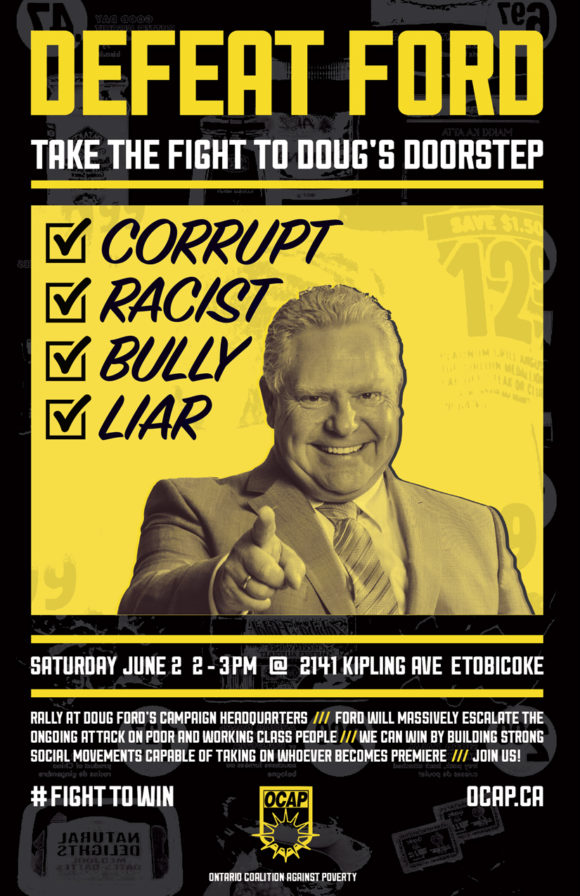
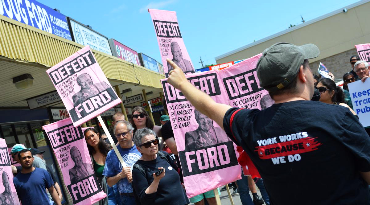
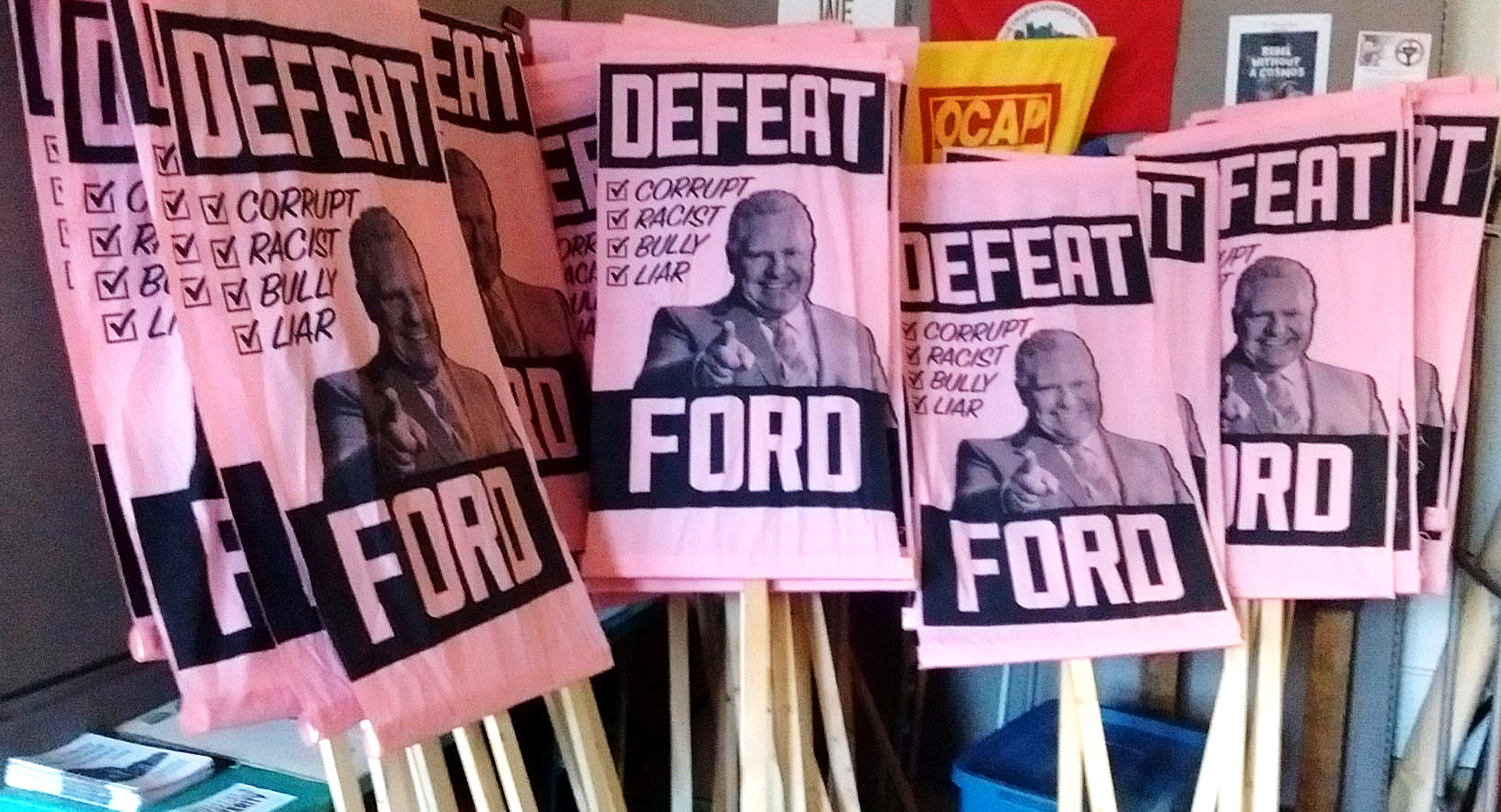
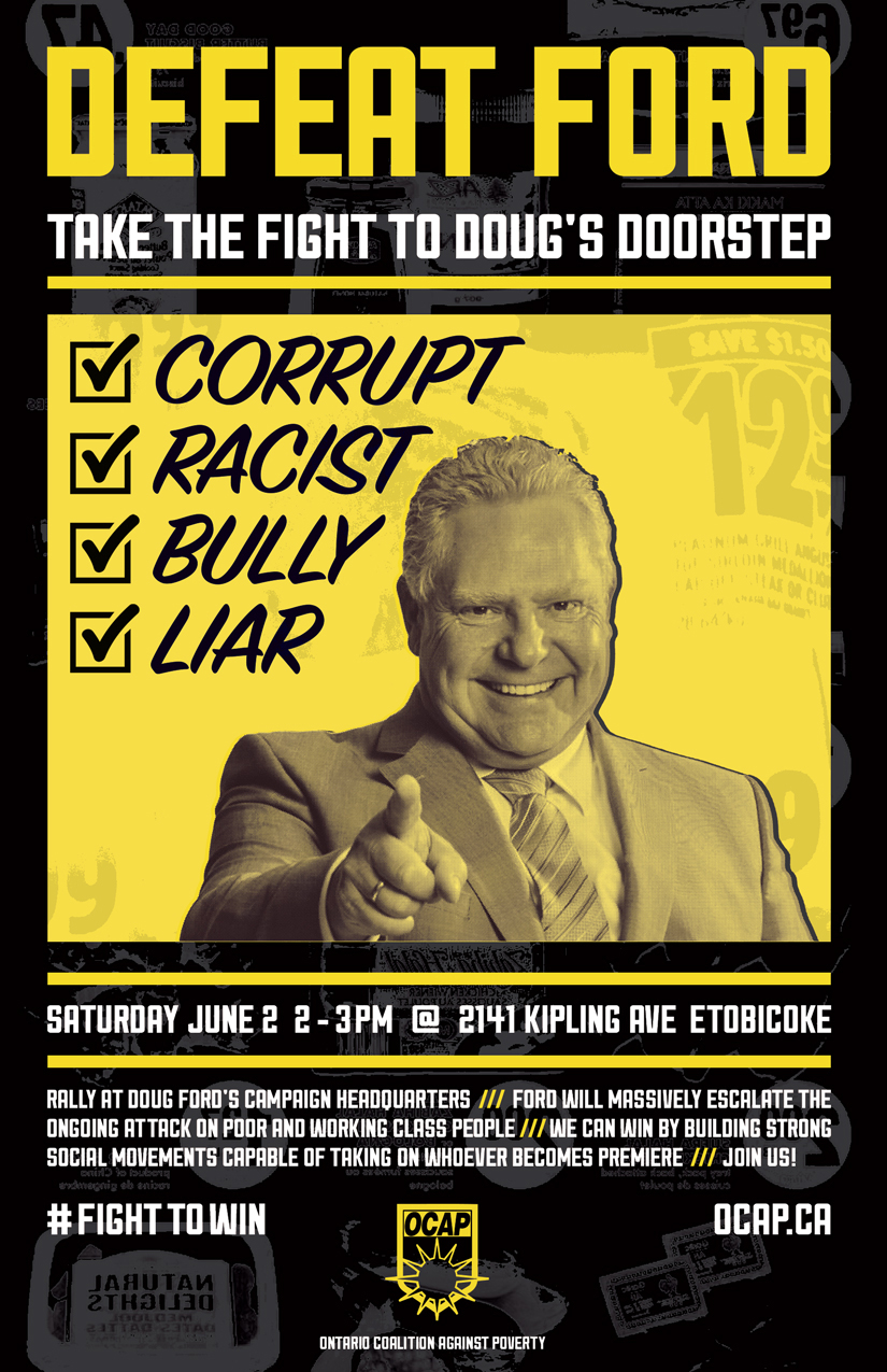
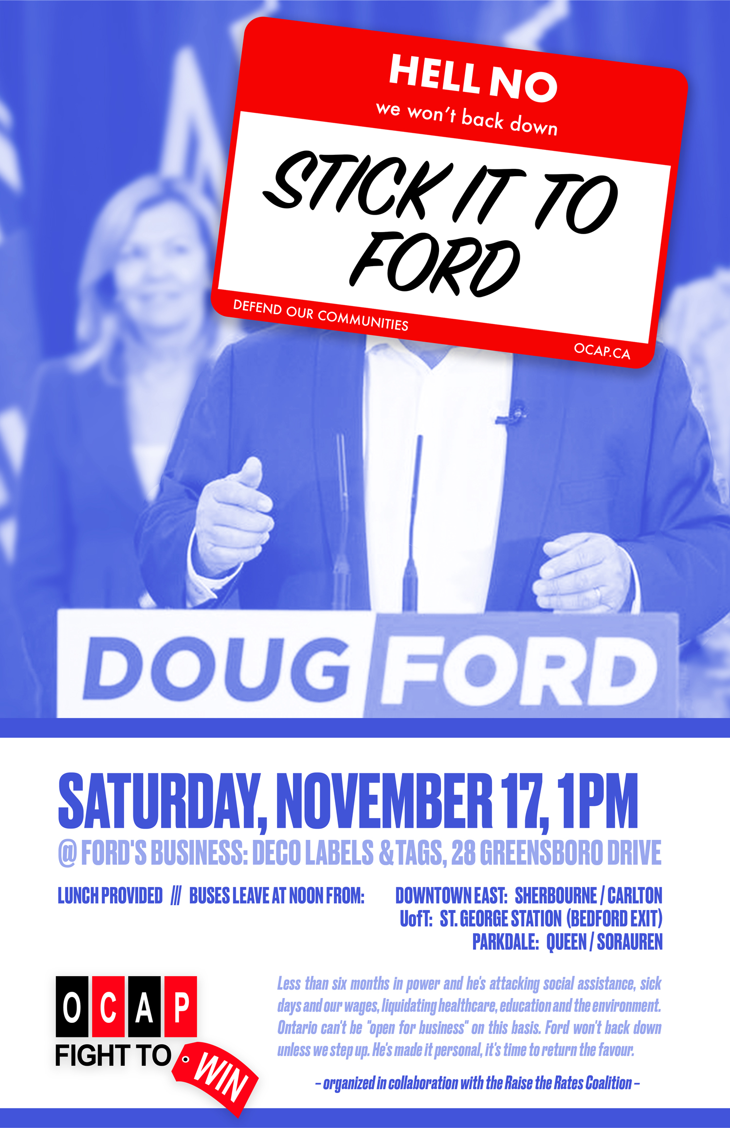
I see Doug Ford’s face every morning. A large pink flag with his grinning mug and the words “Defeat Ford” hangs in my window. I’m currently working on my third Doug Ford piece – in anticipation of drastic cuts to social assistance – but at least this time I get to cover up his face with a sticker. He’s only been in office for two months so at this pace I could have over 50 Doug Ford images by 2022. That seems entirely possible knowing what turmoil he’s capable of causing.
We can stop Ford, but it won’t be easy. Only massive mobilizations and concerted organizing by labour and social movements can effectively confront Ford and minimize the harm he causes. Following the Ford government’s election, the Ontario Coalition Against Poverty (OCAP) wrote:
Our message is that their agenda of austerity, war on the poor, attacking workers’ gains, targeting migrants, gutting public services, racism, bigotry, environmental degradation and trampling on Indigenous rights, is inevitable only if we allow it to unfold without mounting the kind of real resistance that can bring it to a halt.
For a politician committed to making Ontario “Open for Business” at any expense, it is absolutely necessary for us to disrupt business as usual.
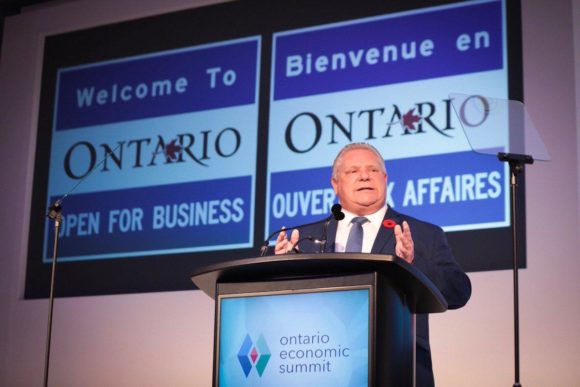
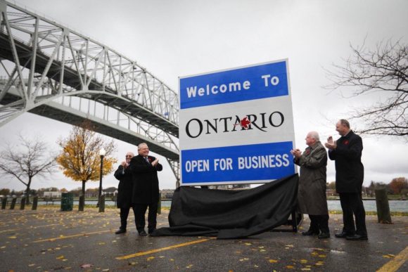
Ford is aware of the power of symbols. His giant “Open for Business” highway signs are a superficial gesture, however they successfully communicate his message to his supporters. Legislative changes have real teeth, but lack flash. The signs are a photo op. As part of our fight back against Ford’s political agenda, we must tear down these symbols and show them for the hurtful lies they really are.
But is that enough? When we counter his fictions with our truths, and come together to defend our communities from his attacks, we also need to present palpable alternatives that reflect our collective needs and desires. Left populism may be the necessary antidote to right populism, but what will it look like?
Is it possible to oppose and propose? Can we help to take down our enemies and build up our communities with activist art? I’m borrowing this pairing from Andy Cornell’s book about the Movement for a New Society, founded in Philadelphia in the 1970s. This activist group, which emerged from the anti-war movement, is said to have “pioneered forms of consensus decision making, communal living, direct action, and self-education now central to anti-authoritarian movements” through their prefigurative organizing.
Movement artist Favianna Rodriguez helpfully distinguishes between art that intervenes in “action space” and “idea space”. The former generally takes priority over the latter due to the urgency of immediate responses compared to the longer-term work involved with creating cultural shifts around major issues like class, gender, sexuality, migration and colonialism.
In thinking about how to defeat Ford, what lessons can we learn from the visual strategies of previous fights? I’ll start with the most obvious parallel: Mike Harris, whose provincial government ushered in a devastating series of cuts and malicious policies under the banner of his “Common Sense Revolution” (which we have yet to recover from). After Harris, whose shitty policies I lived through but was not old enough to contest, I will draw from my own experiences with social movement organizing in the second part of this piece.
This is a quick visual survey, a sampling of campaign materials used for public outreach, and not a comprehensive study. OCAP, which mounted significant challenges to the Harris government and continues to organize against austerity measures today, is the source for these images. I can’t do justice to the full history and complexity of each image in this space, but I’m open to expanding on this in the future.

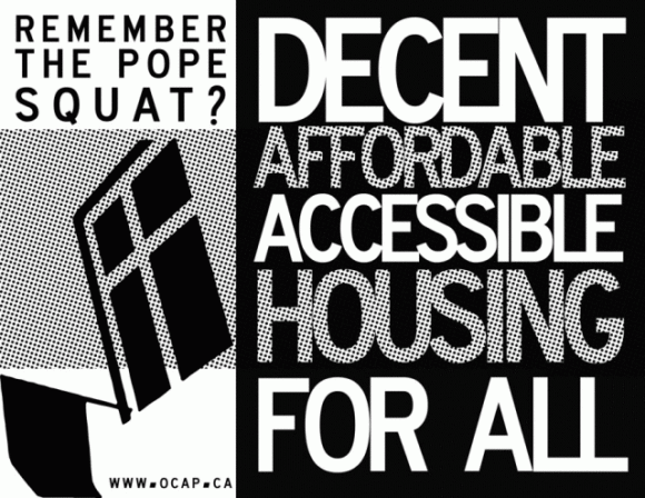
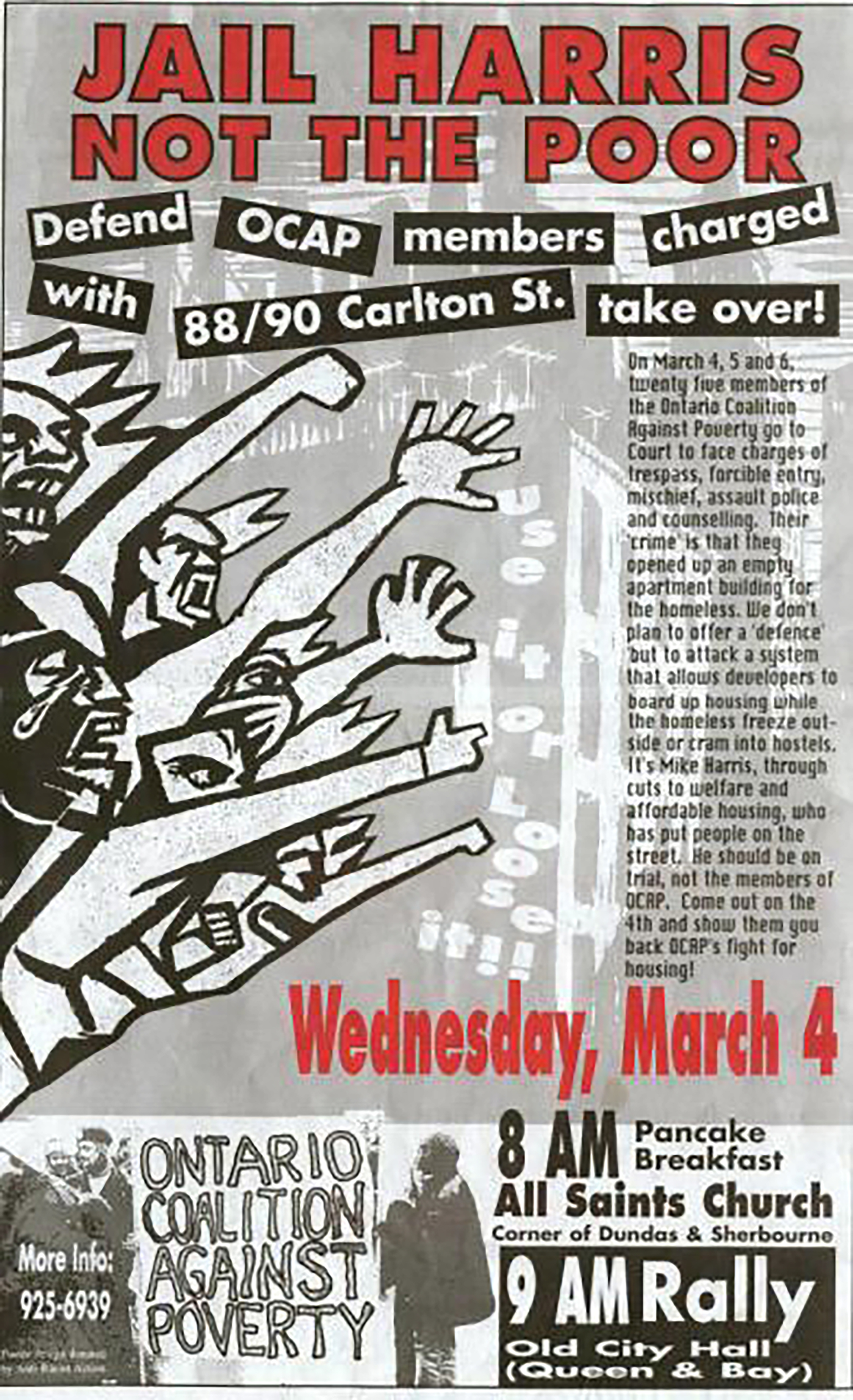
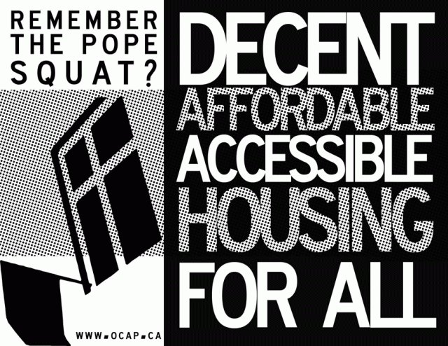
The oldest poster in this set, which happens to be the only image from Mike Harris’ first term, strikes an effective balance between opposing and proposing. An angry and grieving mob, drawn in bold black-and-white lines, issues a compelling set of demands: “Jail Harris – Not the Poor” and “Use it or Lose it!”, meaning that properties should not be allowed to sit vacant for years amidst a housing crisis. The occasion for the event – court support for squatters of 88/90 Carlton St. – is more than just reactive, it fits within the context of an inspiring building takeover, which was ultimately converted into social housing.
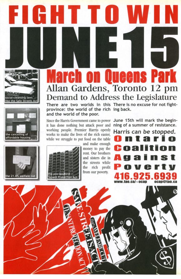
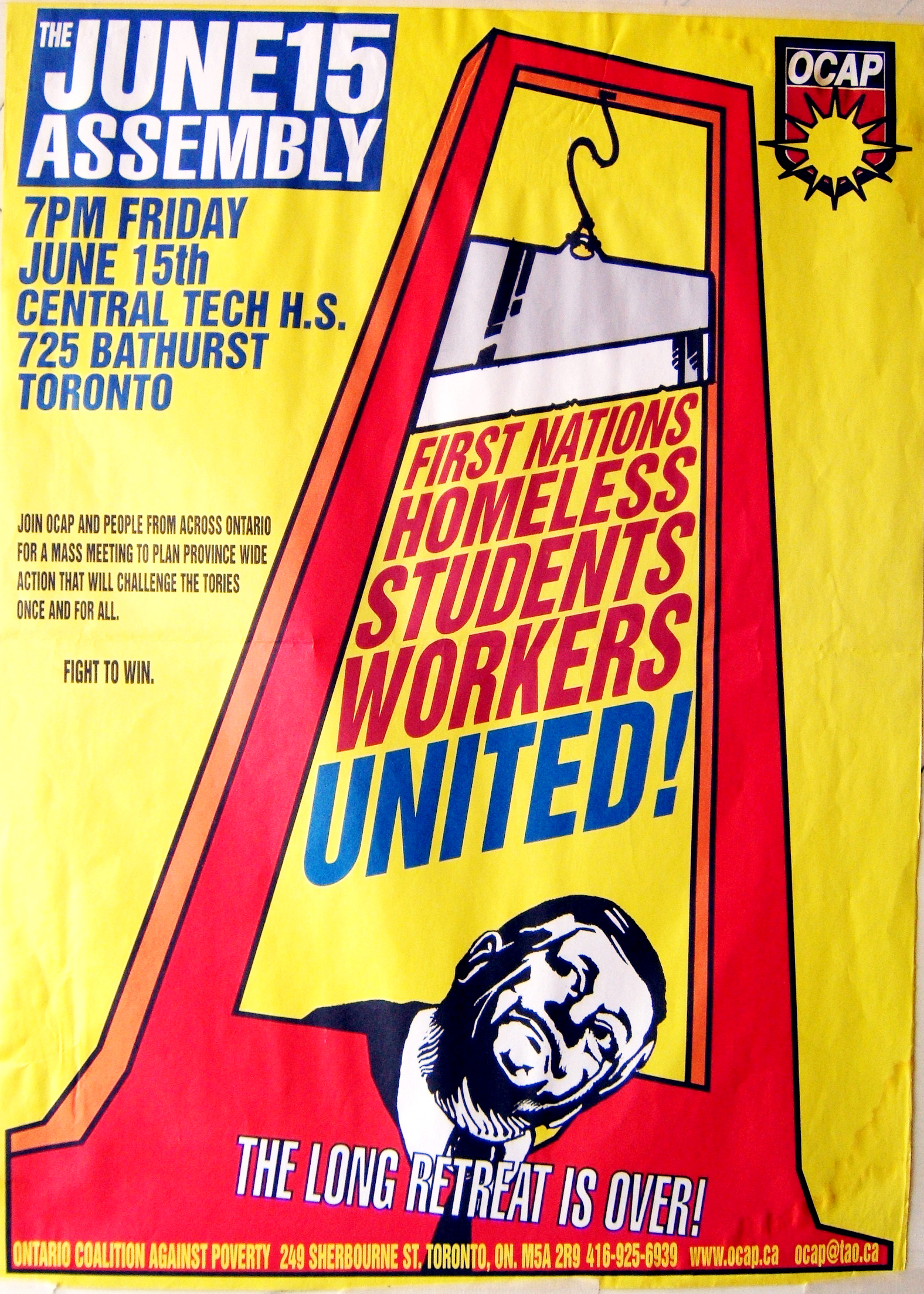
Next is June 15, 2000: a day for the history books. What became known as the “Queen’s Park Riot” was a watershed moment of resistance to the Mike Harris government and the neoliberal ideas he championed. This poster made the case and helped set the tone for that day. The primary focus is on the necessity of fighting back, but there is also a crucial affirmation: “Harris can be stopped.”

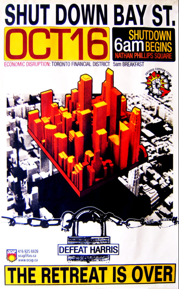
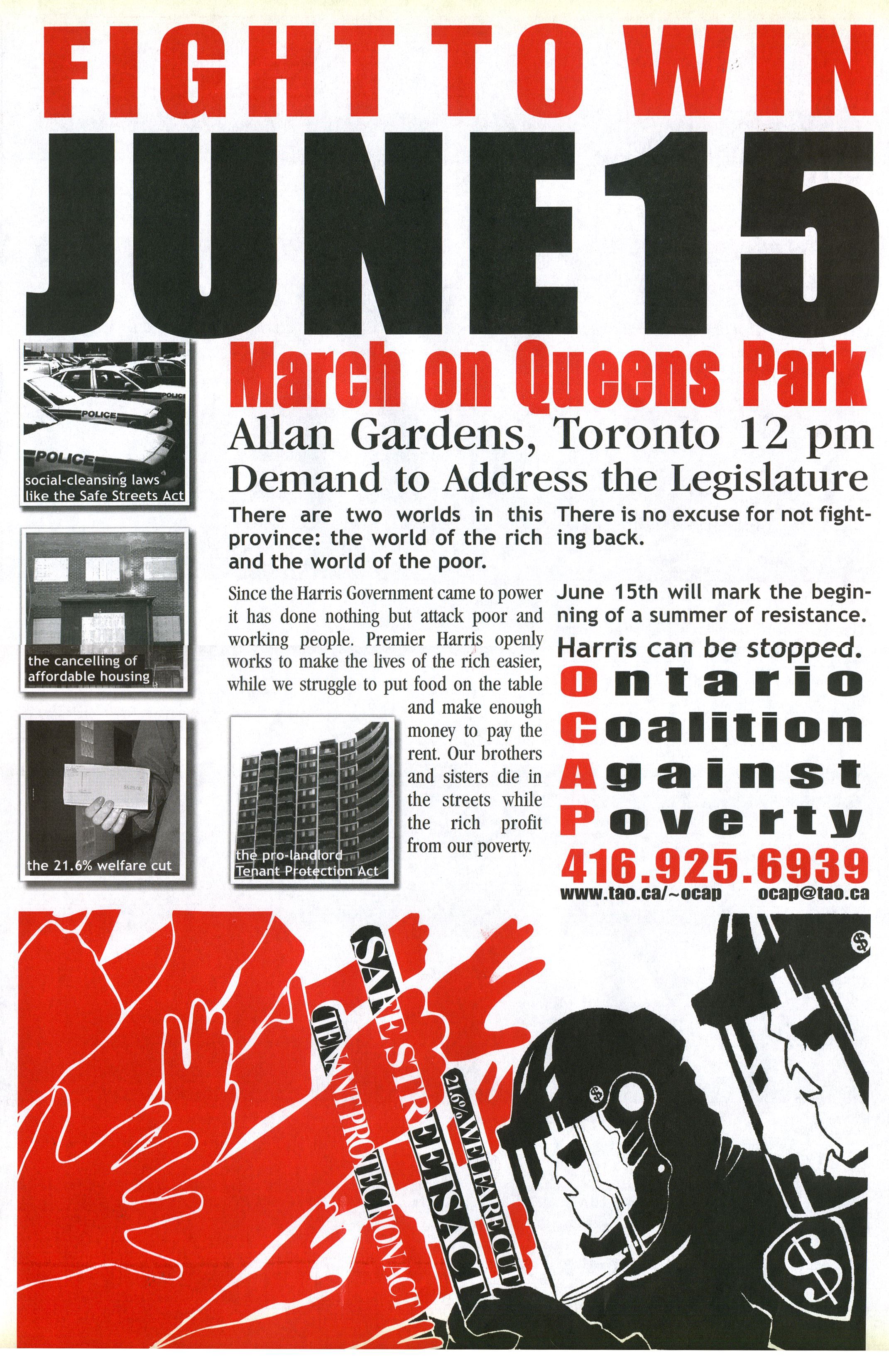
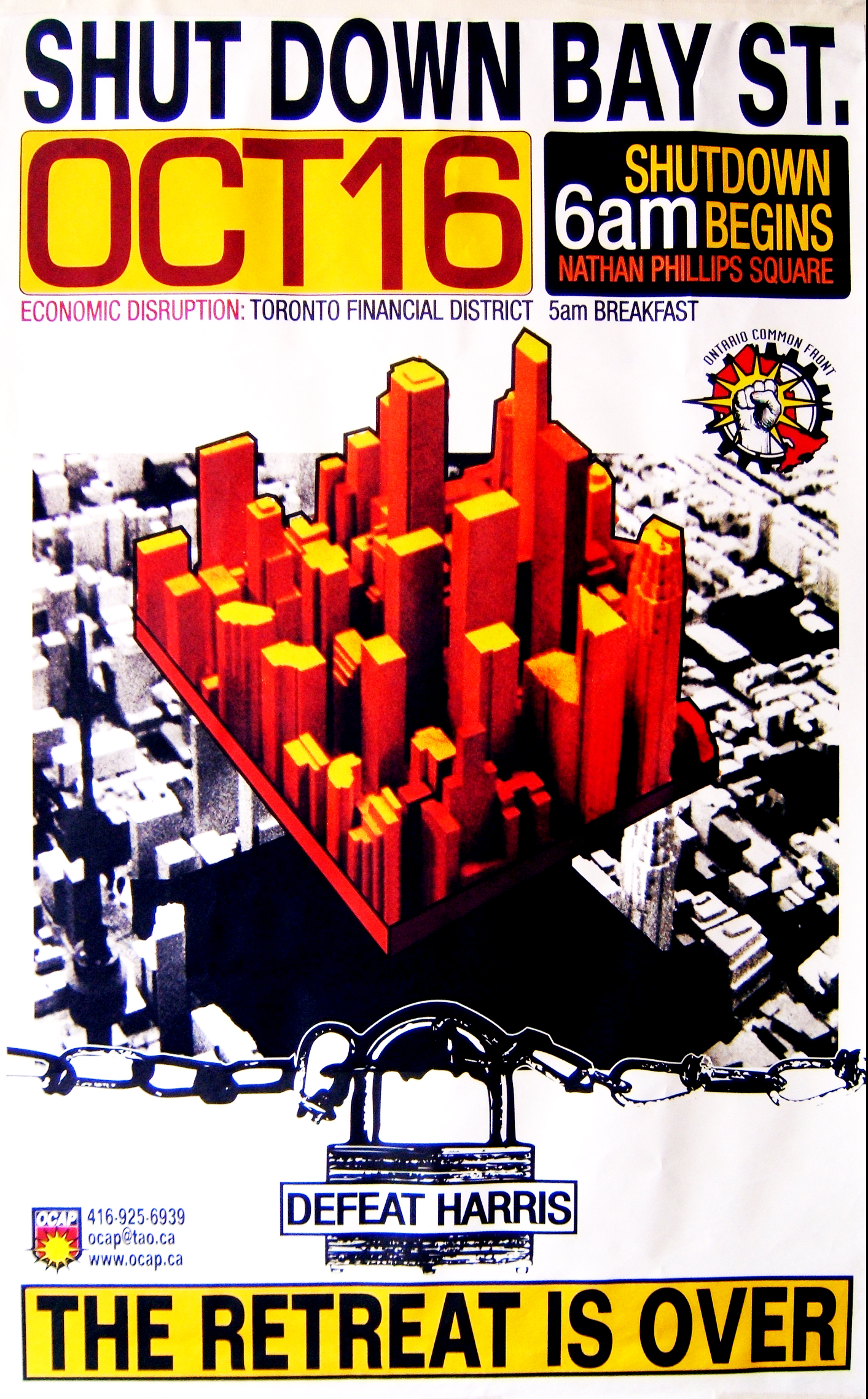
A clear message emerges from June 15 onwards: “Fight to Win!” In order to defeat Harris, OCAP’s conviction is that we need to move beyond the “mass therapy” style of protest for protest’s sake. As attacks intensify, militant actions are called. The rhetoric escalates and the gloves come off: Harris is put under the guillotine and Bay Street, the financial core of Canadian capital, is put on notice for shutdown. Again, these are primarily strident images for fuelling the fight back, tinged with beams of courage.
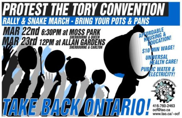
The Ontario Common Front’s “Take Back Ontario” is drawn in the same style as “Defeat Harris!” (above) but is organized under the banner of this larger labour and community coalition. For this action, organizers took the fight to the Tories, along with their progressive list of demands.


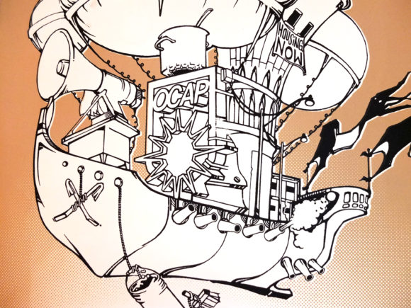
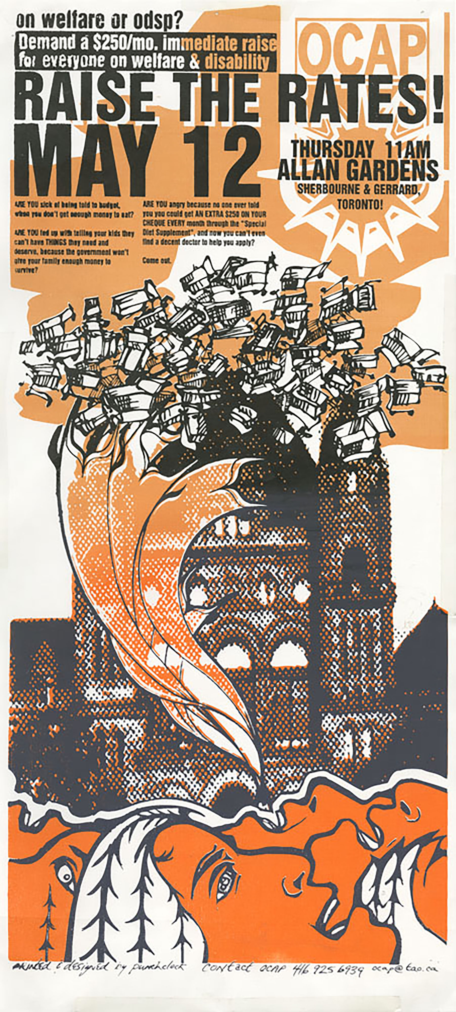
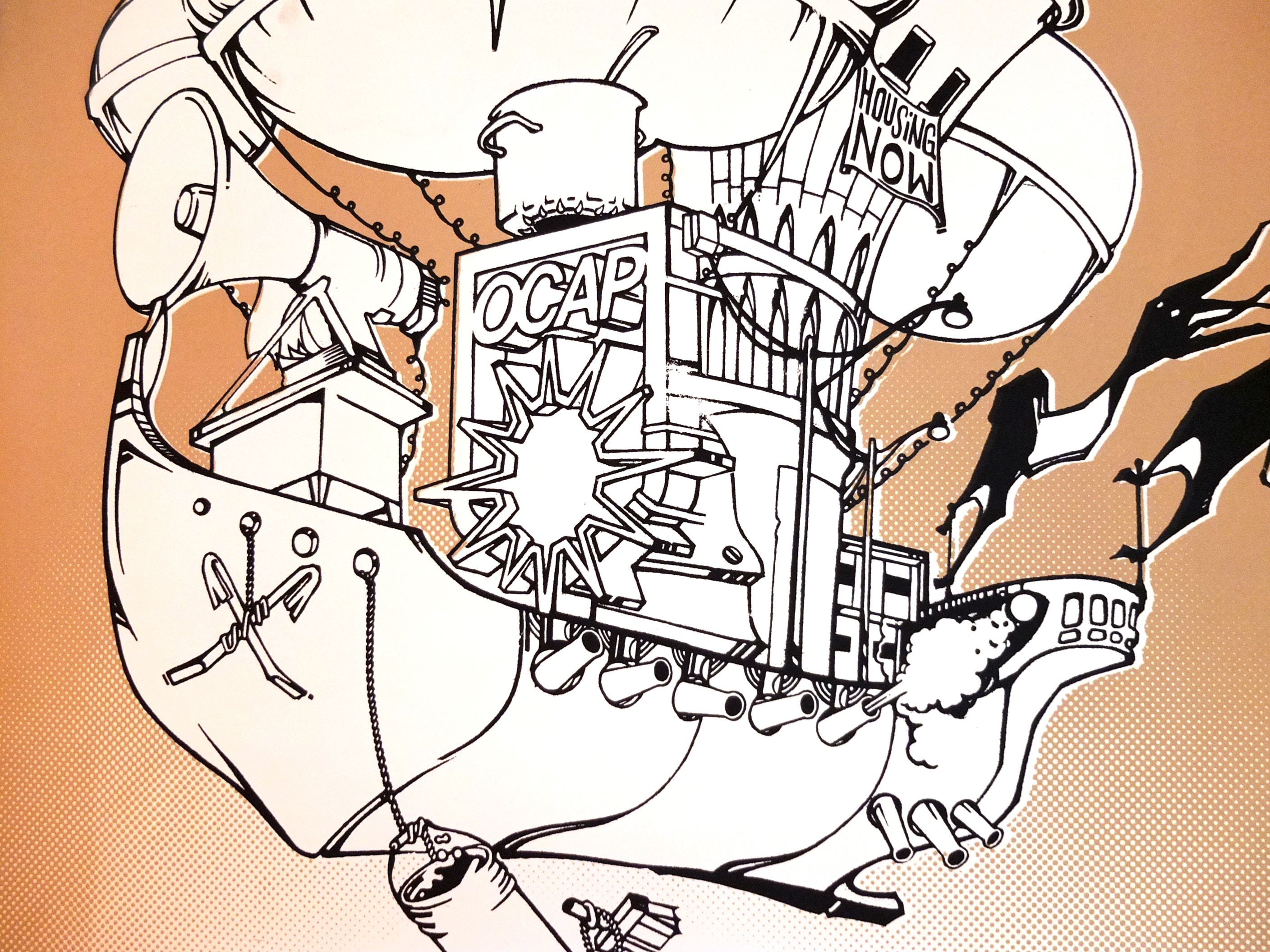
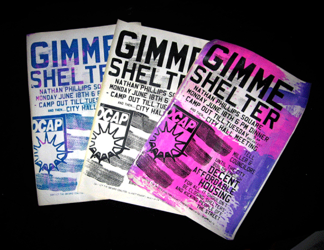
OCAP never shies away from opposition, however in the images from 2003 onwards there is a noticeable change. The aesthetic opens up, becoming more imaginative, and action-oriented posters are joined by beautiful prints that evoke the spirit of direct action without the constraints of a specific event, date, and the usual expository text. These images are “nurturing as well as damning”, in the best sense of the words.

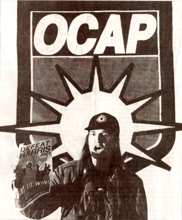
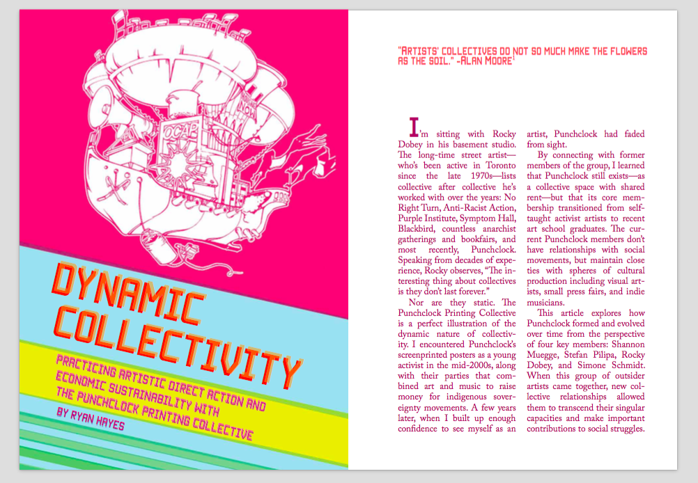
What explains this shift? In 2003, OCAP activists Shannon Muegge and Stefan Pilipa opened Punchclock Printing as a shared space to screenprint posters and shirts for activists and non-profits. Along with 250 others, Shannon Muegge and Stefan Pilipa faced politically-motivated charges for participating in the June 15, 2000 demonstration. As I’ve written elsewhere:
My sense is that Punchclock is one example of the ingenuity, creativity and resilience that came out of June 15. The noxious experiences of being arrested, facing criminal charges, and having to live with restrictive bail conditions are, in some ways, a perfect cauldron for such a development.
Founding Punchclock was a natural extension of their activist and artistic work, creating new opportunities for political activity and expression – and not just for themselves, but also for a new generation of movement artists.
In our fight against Ford, our task is to learn from their collective experience. My initial reflections are below. If you have additional thoughts, I would love to hear them.
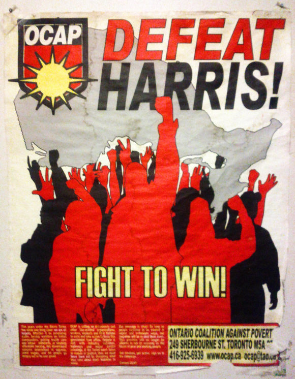
Every image from the Mike Harris era calls him out directly. By October 2001, Harris’ approval ratings had plummeted and he announced that he would be resigning, so the March 2002 Ontario Common Front events target his party’s convention. Most connect Harris – the enemy we know best and the focal point of our anger – to larger systems of power he represents: Harris > Conservative Party > Bay Street > Ruling Class > Economic System (Capitalism).
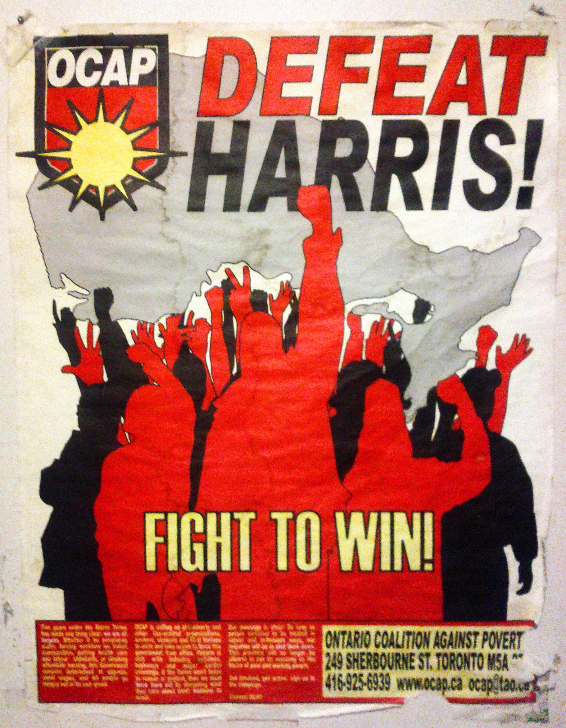
Only one image in this collection actually features Harris, and in that example, it is a kind of revenge fantasy – a role reversal emphasizing the collective power of the poor and vulnerable when we fight back. This kind of affirmation is incredibly important. We must emphasize our strength, our resilience, our agency, and our ability to build a better future by stopping Ford. As part of our resistance, we must put forward our own ideas, emphasizing that another way is possible and desirable.
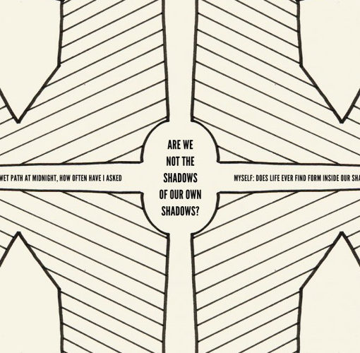
We want to connect with people on an emotional level, a gut level, beyond facts and arguments. Ford is good at this. We need to be as well. In the realm of the senses – or, what we feel – I want to speak to the evocative power of illustration. There’s something about hand-drawn images that stand out for me and invite deeper contemplation. I primarily work with digital images and photography, which is the prevailing mode of production today. This style works well when you want to project a clean, modern image (“legitimacy”) or “culture jam” a politician’s own branding and visuals.
I think both approaches need to be part of our repertoire. The point is to consider how our audiences will interact with our materials and whether they might form an emotional response. By design, a poster operates differently than an email or a pamphlet. We want it to be arresting, to make you stop-and-look, and that requires a clear idea and an economy with words. As a process tool, sketching is probably the most generative way to come up with novel concepts, even if the intended output is entirely digital (and even if, like me, drawing is not your forte).
These ideas – channeling anger and other emotions, linking your target to larger power structures, affirming our collective power, offering new narratives, and trying to connect with our audiences on a deeper level – continue to resonate today. If anything, images that carry evidence of the human hand at work are all the more unusual, and may be even more potent.
However, there are important differences as well. OCAP provides a helpful frame to understand our current context:
Comparisons are made to the Tory Governments in Ontario from 1995-2003. Let’s be clear that Ford represents something far worse. The international austerity agenda is far more advanced than during those years. We have also gone through fifteen years of ‘progressive’ Liberal cutbacks that have left their mark on public services like healthcare, ensured that people on social assistance are poorer than when the Tories left office and produced a housing and homeless crisis of terrible proportions. Frankly, there is very little flesh for Ford’s knife to cut into. It will be going into the bone.
When the Tories last held power, there was a powerful mobilization against them but it failed to stop them because it was held back by disunity and a failure to take things to the level necessary to win. A creature like Ford will not be stopped by moral arguments or token protest. A movement that creates serious economic disruption and a political crisis is what is needed. The Tory agenda must be blocked by a struggle that makes the Province ungovernable.
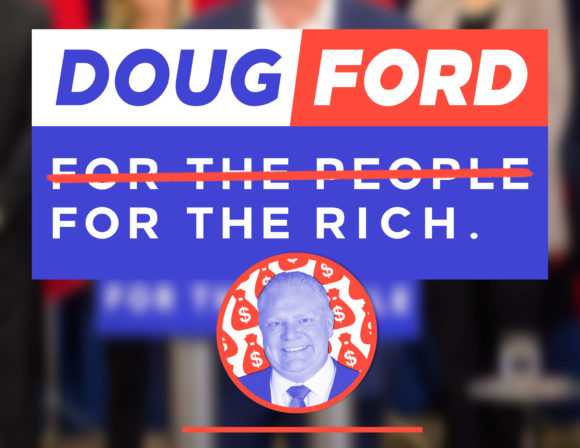
Some people want to play “wait-and-see” in hopes that Ford will spare them. When Ford shows his hand, he will move quickly and they will be unable to respond effectively. Others have cautioned against attacking Ford directly, for fear of alienating many of our “our own people” who voted for him, misguidedly thinking that he has their interests at heart. When the “Doug Ford: For the Rich” graphic (above) was released, in response to Ford declaring that he was cancelling the $15 minimum wage and gutting new labour rights legislation, it was widely shared online, but not by any mainstream labour organizations.
Our next task as organizers is to help activate resistance. We must fight back with every instrument, including culture, on every available terrain. We need to engage our families, friends and co-workers in order to widen our circles of support. We need to cultivate critical connections that we can build towards a critical mass of labour and social movements. We must oppose and propose. We must intervene with actions and ideas. Together we can help turn the tide and defeat Ford.
Fight to win!