Design is a collaborative process. We design with others. We design in conversation with our environments, experiences and influences. We design as members of communities, with all of the complex relationships and responsibilities that entails.
Even when working alone, say on a self-directed project, we are designing with tools and materials others have fashioned for us. We cannot help but draw on ideas that have shaped us. We inevitably consider the broader world our designs will inhabit, and seek to influence it or take a step back from it.
We imagine, research, sketch, seek feedback, revise – and many times – start all over again. It’s a gradual, iterative process. And ultimately it’s also a process that is full of rejection, both internal and external.
All this to say: I’ve been at this for a while now (over 10 years) and thought it might be fun to share some ill-fated designs, along with some commentary speculating on reasons why they ended up in the discard pile.
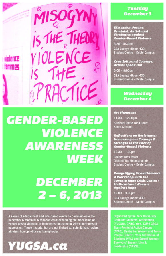
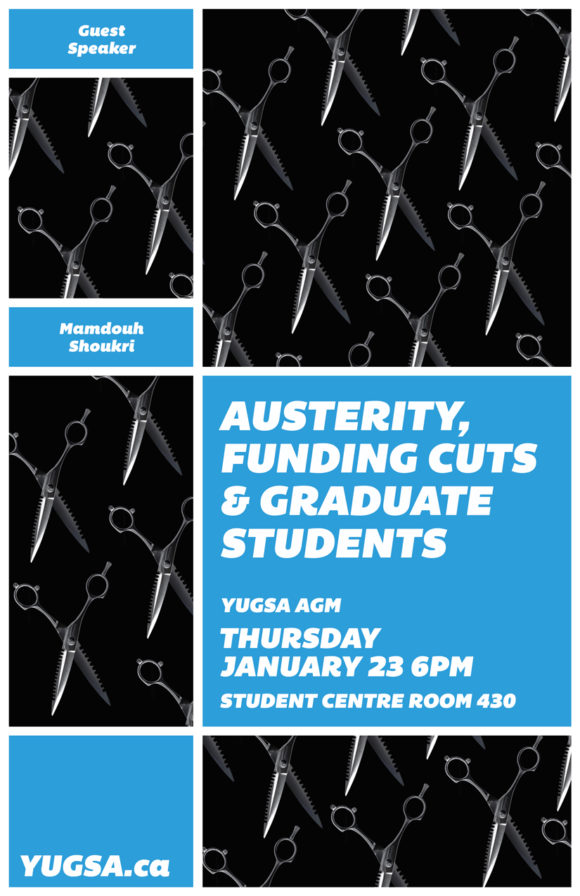
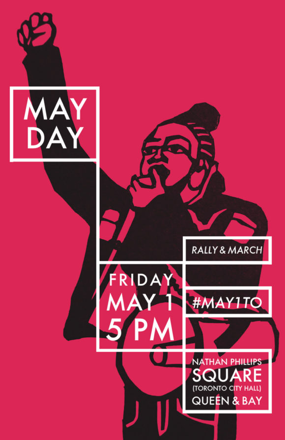
1. NEEDS MOAR TEXT

Viktor Vaughn. These designs were DOOMED because they didn’t have enough text. Milton Glaser says the goal of graphic design is to inform and delight. But these objectives are often at odds with each other. Trying to make a person feel something and tell them details about a week’s worth of events at the same time is not easy. At some point it may be a question of prioritizing one over the other.
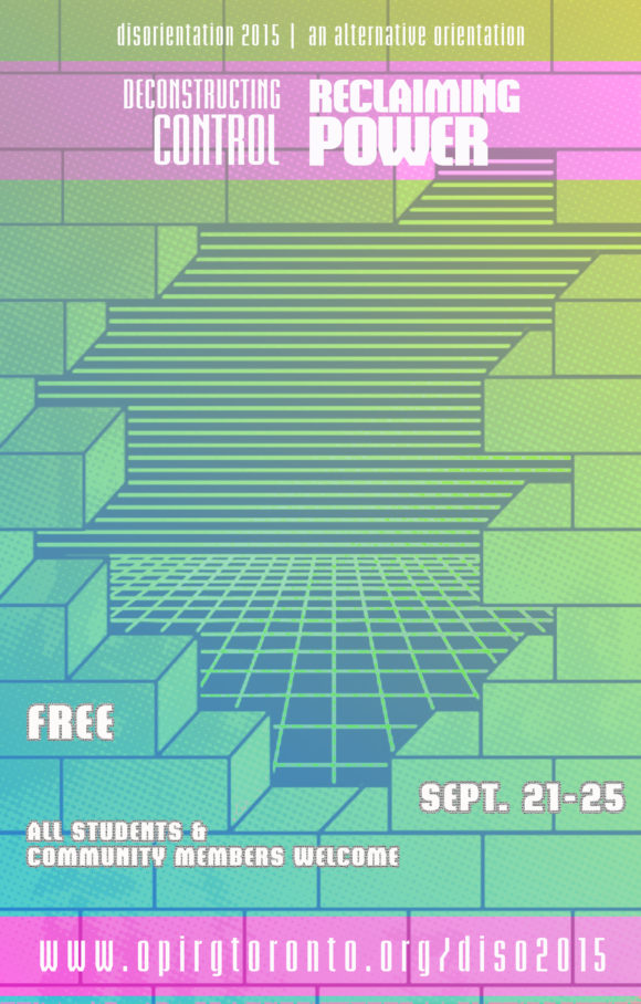
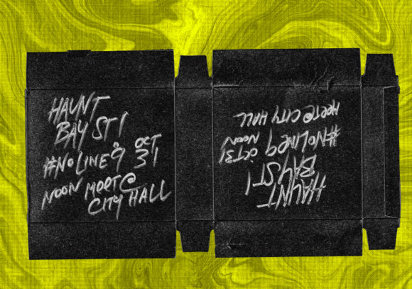
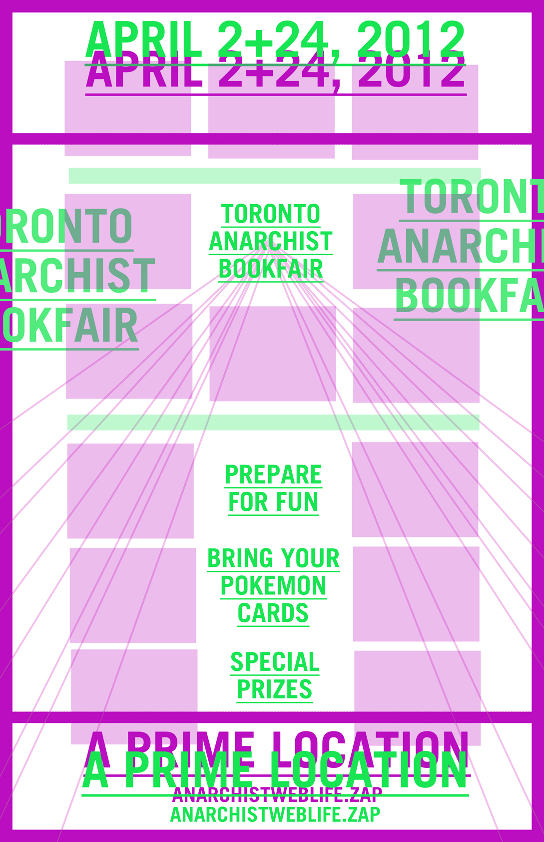
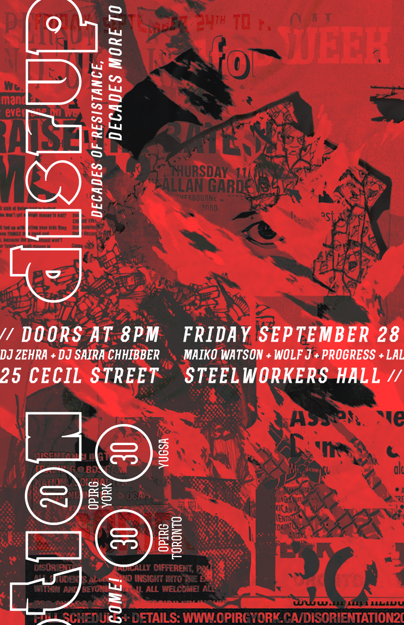
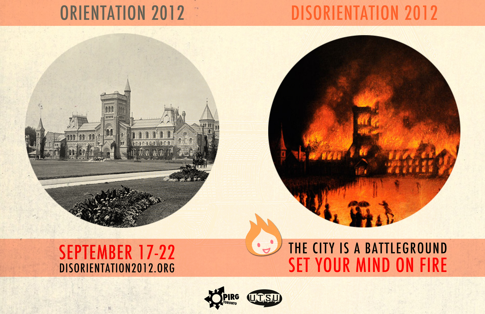
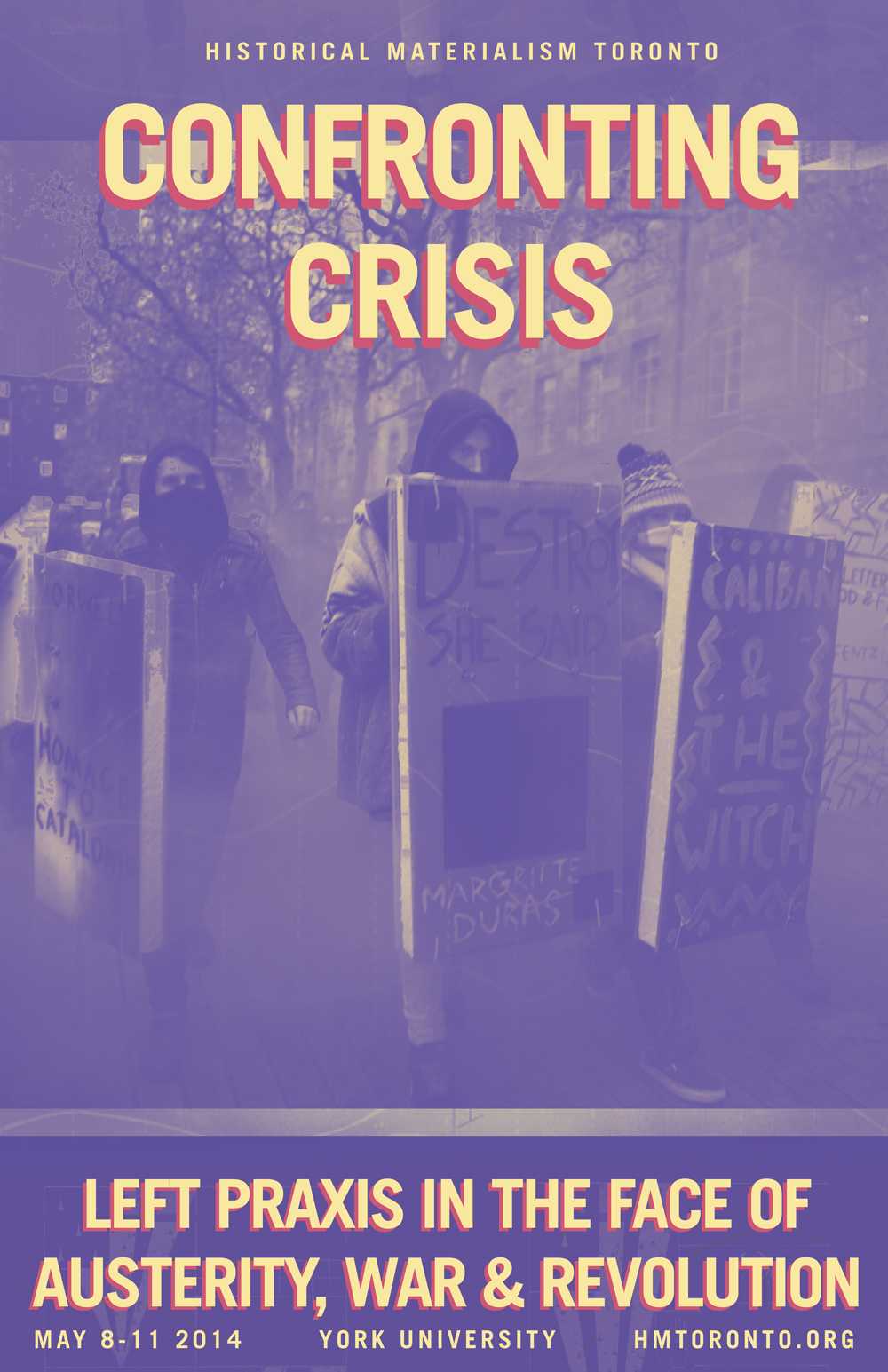
2. NO FUN RULE
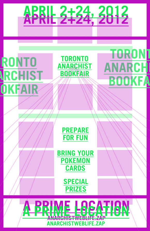
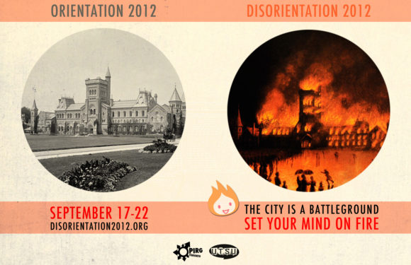
The “no fun rule” may have served a purpose during times of unchecked frivolity but it is now mostly unnecessary. On the left, we see a design mock-up where the designer has included their own lighthearted “dummy text” for a more playful version of the familiar anarchist bookfair. The poster on the right plays on the centre image by cutting away the majority of the content-holding spaces as a way to illustrate the theme of education cutbacks. Sadly, neither image made the cut.
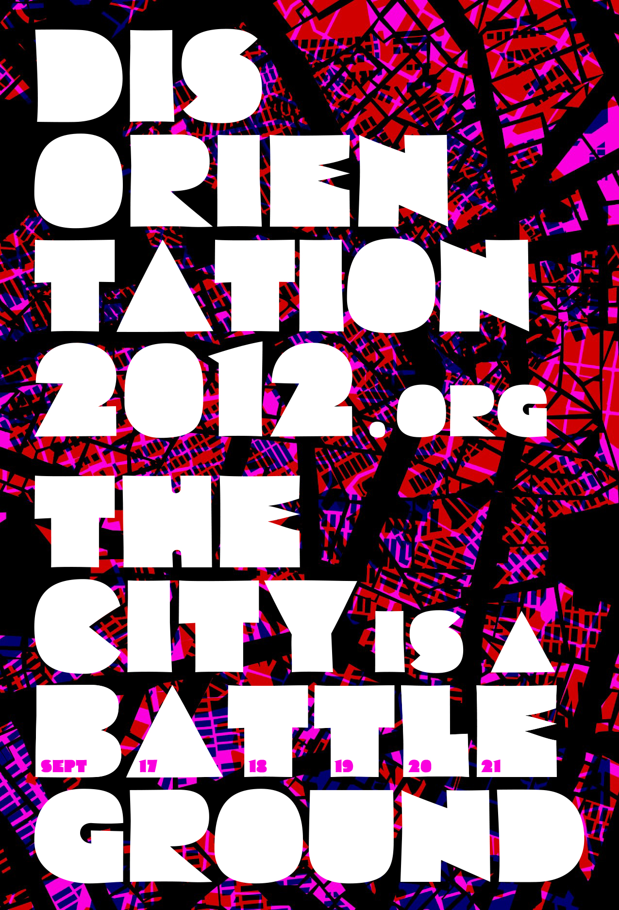
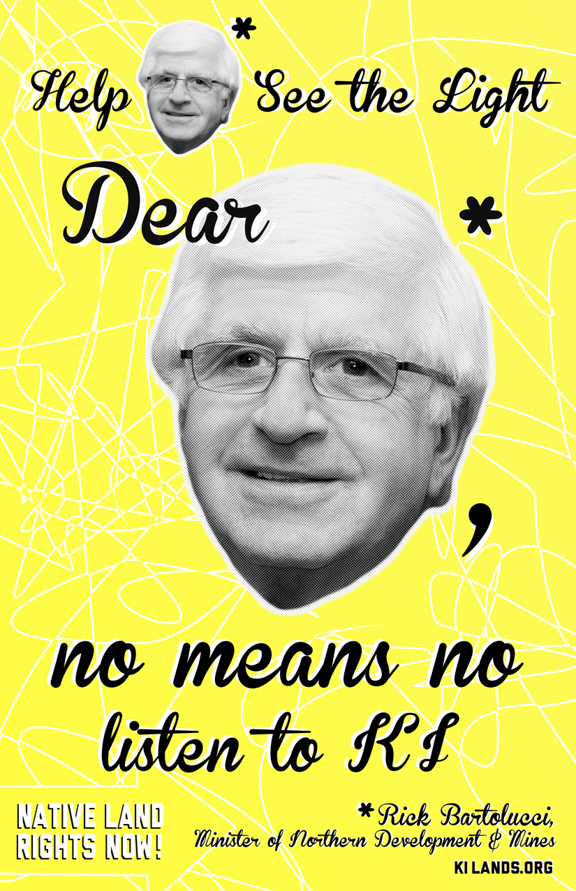
3. TOO WEIRD
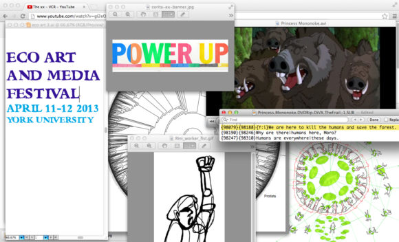
For a broad public audience some weird is good, but too much weird is bad. How much is too much, who can really say? When I’m keyed in, I might find myself in a design sinkhole where time loses meaning, I become invulnerable to hunger, and bathroom breaks are repeatedly delayed until making “just one more change.” This can be an incredibly generative and creative space. However, sometimes the process of deconstruction can go too far. Is it still a poster if you draw it on the first thing you grab out of your neighbour’s recycling bin? Does an assemblage of open windows on your laptop make for a strong poster concept? This designer was told: No.
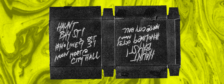
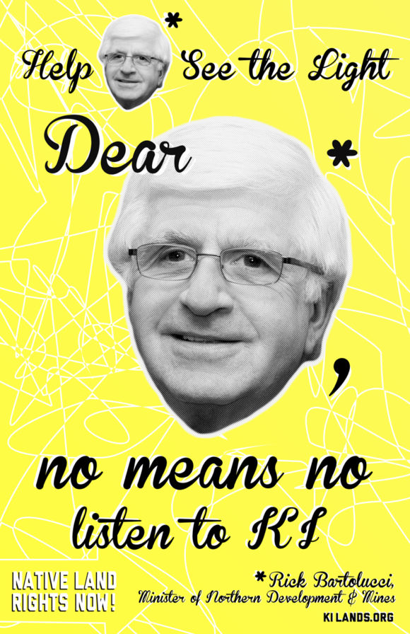
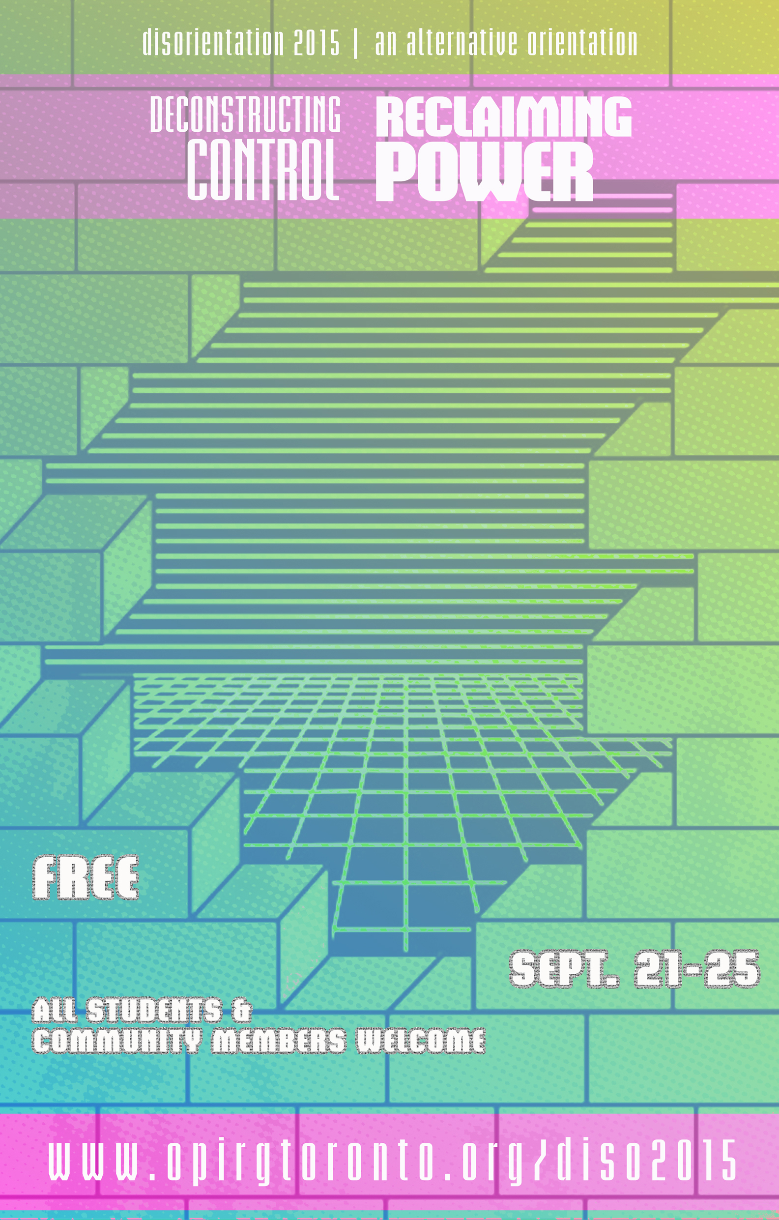
4. CAN’T READ IT

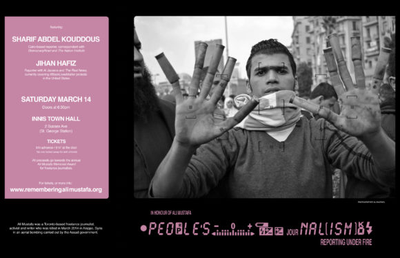
Someone, somewhere, decided that posters should be legible. I didn’t make the rules. Sometimes you want to challenge your audience: “Hey you human, stop and look at this colourful flat rectangular paper thing and take a few seconds to try to decode what it is saying.” At the same time, I can empathize with my fellow human beings. In the process of trying to learn Farsi, I’ve picked up community newspapers and been completely thrown for a loop by unconventional fonts and had no idea what I was looking at.
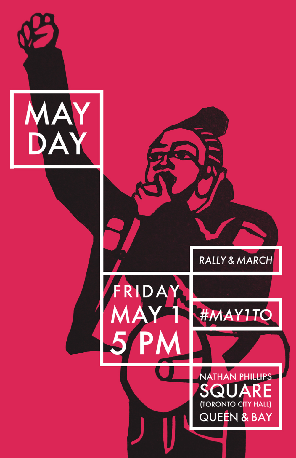
5. OFF SCRIPT
Them: This is not what we asked for. Me: But I love it. Graphic designers™ are officially married by law to creative briefs. Briefs provide a template for their clients to express their needs and desires, including objectives and stylistic preferences. It’s like a roadmap for mutual accountability. Then reality comes along and makes things messy. Some clients may not have time for this, may not know what they want, their needs may change, or a designer may have an unsolicited idea to pitch. These are all legit loopholes with varying rates of success. A roadmap is good, however the keys to building a strong working relationship are shared values. Part of this relationship is recognizing that each party is bringing some expertise to the table. If the process becomes too one-sided, the outcome will surely suffer. Thank u, next!
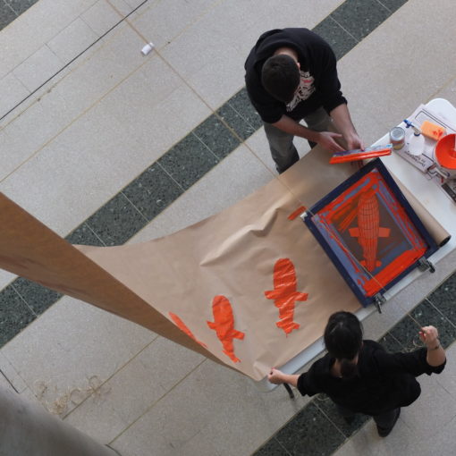
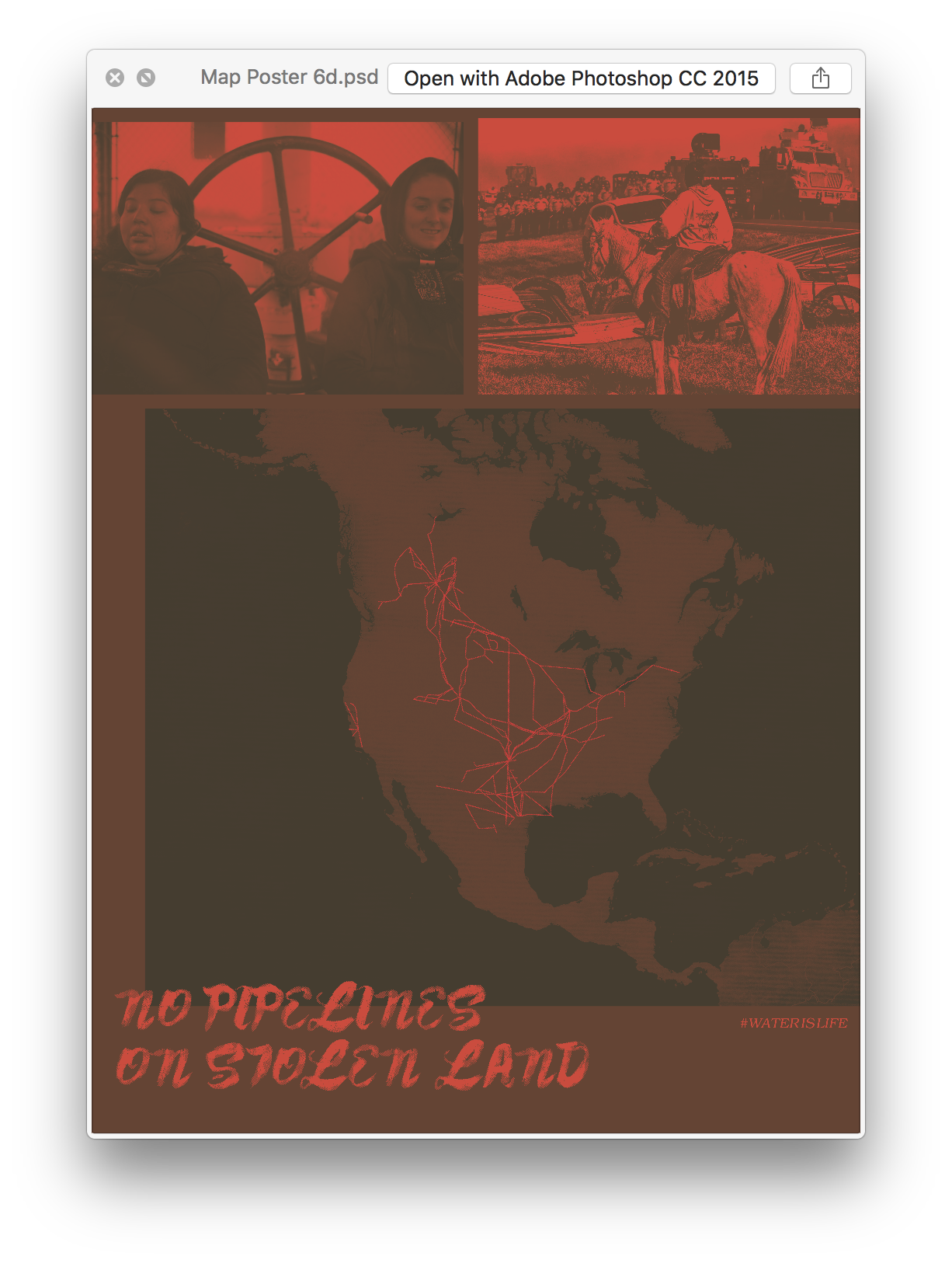
6. WILL IT PRINT?

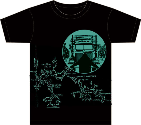
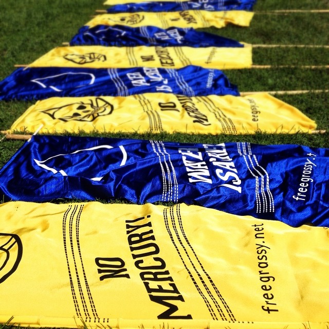
Print lovers embrace the productive tensions involved with bringing something “born digital” into the material world. We experiment, test the limits of our tools, and push up against those limits. Some digital concepts are simply impractical to produce due to prohibitive costs or other barriers. A fluorescent collage that cooly glows on an RGB screen can come out pretty dull looking on the other end of a traditional CMYK colour photocopier drum. Similarly, a t-shirt design may be unsuitable for screen printing due to the challenges of printing end-to-end on sewn fabric with modest equipment. (Also, I was told that the government map of Grassy Narrows that I scanned was inaccurate, so that didn’t help).
BONUS: BRB

Why don’t we see more design rejects? I don’t think it’s because they are bad. Many are quite good even. They are likely awaiting rehabilitation. Unused designs are a great resource to revisit later, offering a concept that can be given new life. A piece of a past design may find its way back into our work, like a particular colour scheme or typography choice. Sometimes there is a drive, an irrepressible urge, to express an idea and one way or another you will get it out. You might just really want to make a poster featuring a Book Bloc, or with a broccoli-inspired colour scheme, or to print something in the shape of a triangle. These false constraints can be fruitful. So don’t be surprised if you see something resembling the images above in my future work.
Note: All critiques are also self-critiques, made in good fun, no sour grapes, jelly belly, all power to the people.
