One of my goals with design work for movements, beyond making effective tools for education or outreach, is to avoid waste by producing things that people might want to keep – to make ‘keep sakes’ that hold memories and meaning (including as aesthetic objects). I’m not sure how progressive that impulse ultimately is, but it’s definitely there.
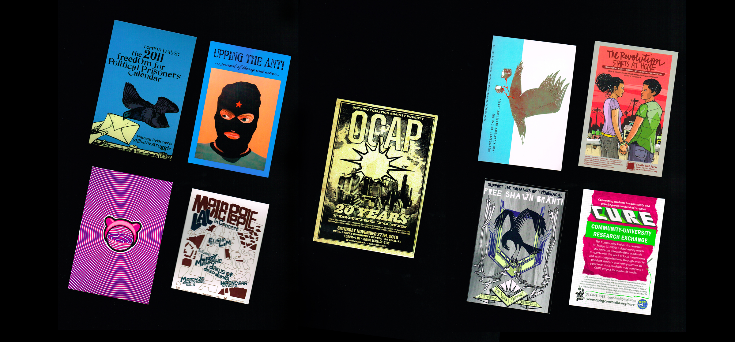
While working on a postcard for an upcoming event, I had the opportunity to sort through my personal collection from social movement and cultural events, and consider which ones I liked the most. I’m sharing a few of my favourites here, though I’ve focused only on the front sides. Balancing the text-heavy content of the reverse is its own art.
I guess postcards, or rave cards as I’ve also heard them called, signify access to more time (for the turn-around of a print shop) and resources ($$$) than say, a quarter-page flyer printed on regular paper at home, school, work, or a 24-hour copy shop. So it often feels like there’s been considerable thinking about the design as well.
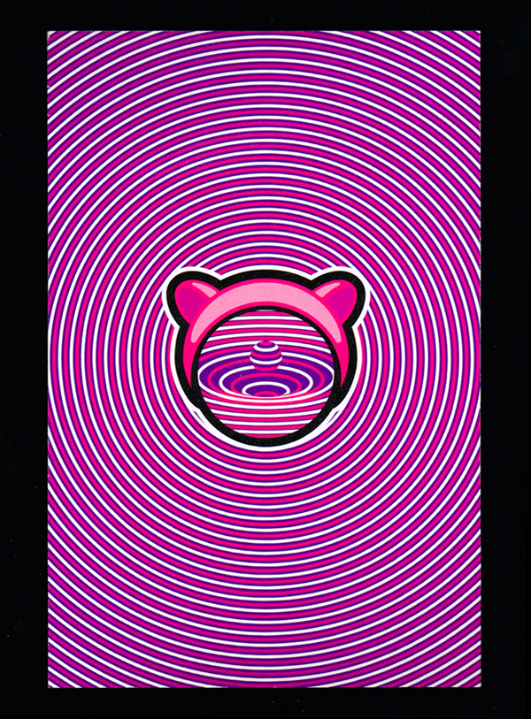
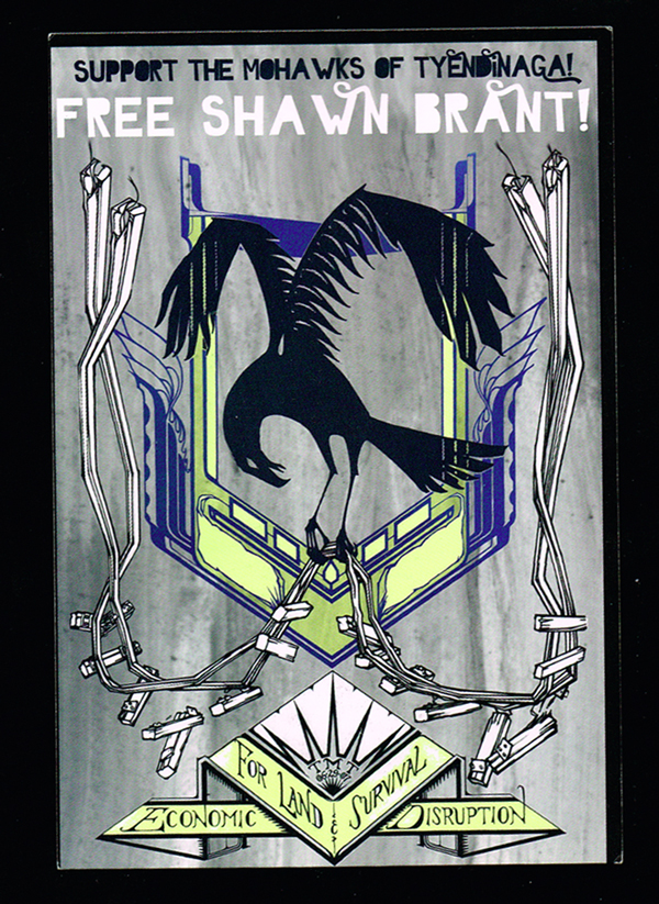
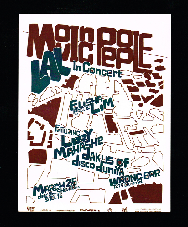
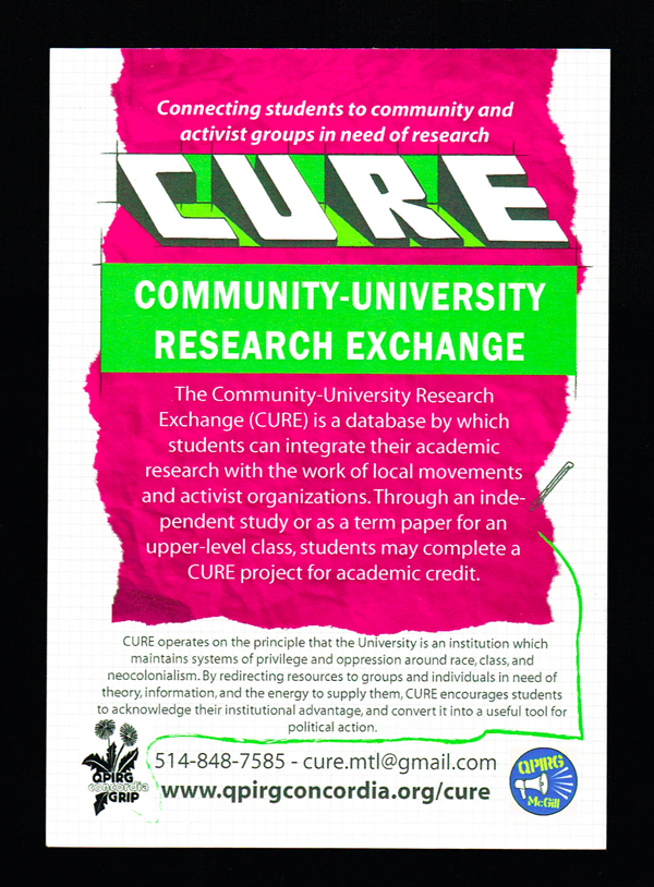
4×6 seems to be the standard format. Over 90% of the postcards in my stack are 4×6 inches. A couple are smaller and a handful are larger (I find the large ones a little unwieldy and less pocket friendly). 4×6 is a familiar size for travel postcards and personal photographs.
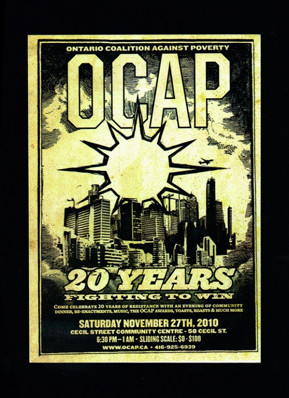
Organizers primarily use postcards for outreach and education, however a few double as actual postcards for mailing, particularly those that are not date-specific. Some are for personal use while others are produced with a campaign in mind and are intended to be mailed to someone like a Minister in government.
One thing that is often overlooked about outreach materials is the personal dimension. Postcards tend to be exchanged hand-to-hand or picked-up from a particular location where they’ve been dropped off. But because of their DIY immediacy, flyers still have the most personal feel.
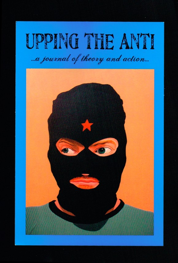
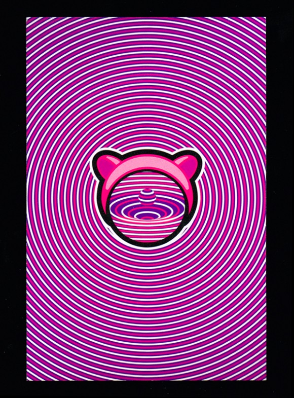
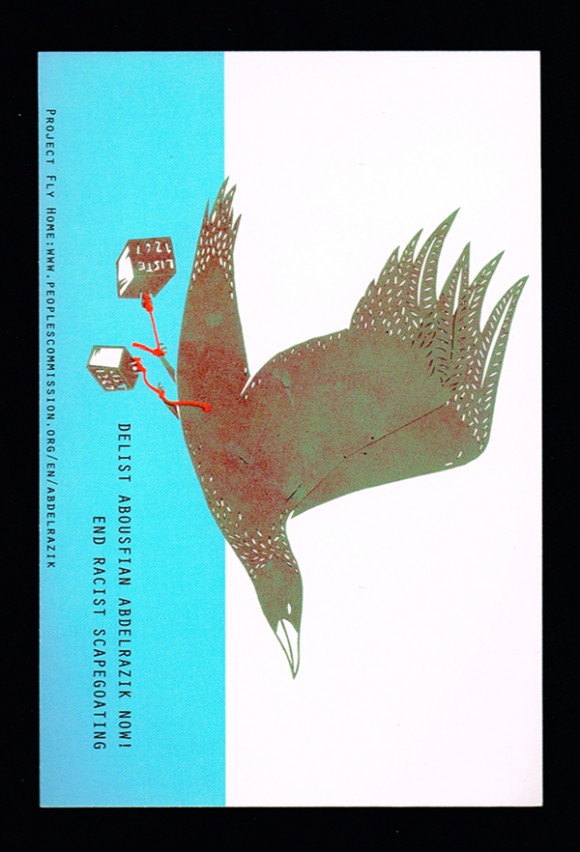
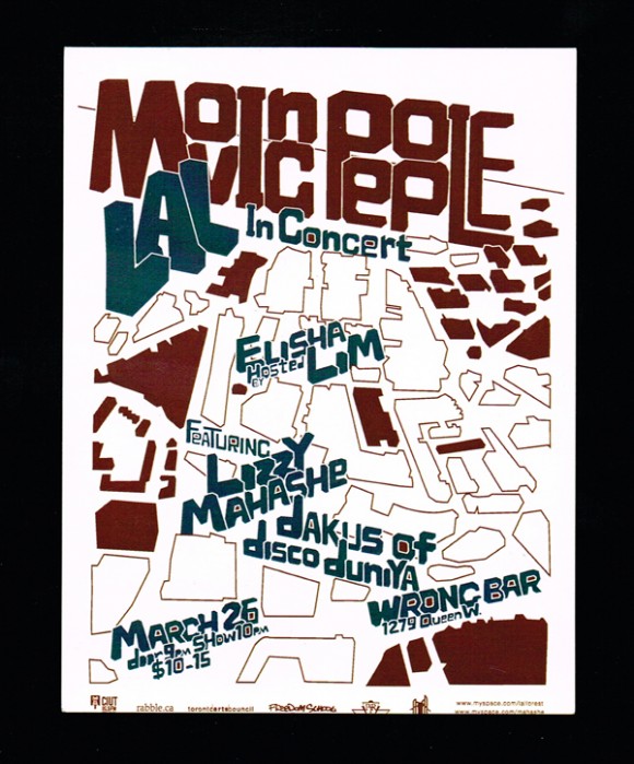
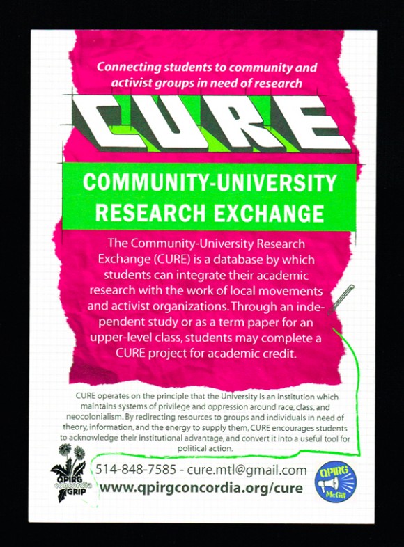
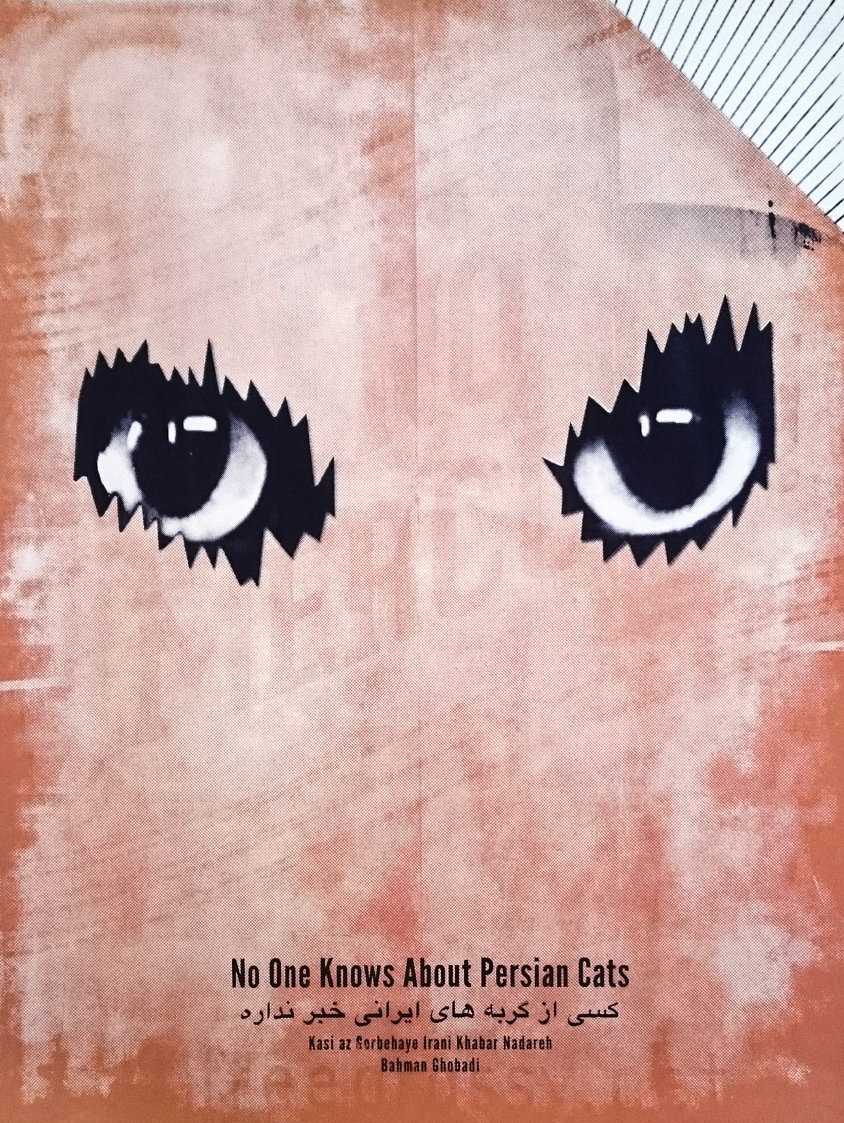
Interestingly, none of my favourites are based on traditional photographs – they’re colourful combinations of hand-drawn (or painted/printed) and digital illustration styles. The postcard on the bottom left (of the header image) looks like an actual rave flyer, but it’s from the TRIP Project, which totally makes sense. The CURE postcard on the far right is bilingual with French on one side and English on the other.
Update: I added five more of my favourites. I like them so much that I included two with strong photographic elements (even though it contradicts what I wrote above), and bent the rules to include the CAIA bookmark.
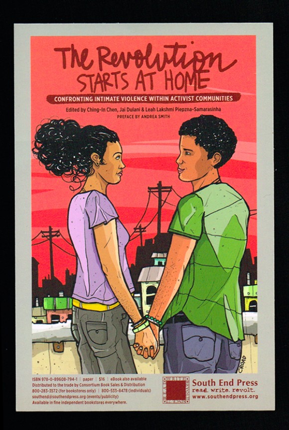
They’re all from collectives or projects based in Toronto or Montreal, with the exception of The Revolution Starts at Home, which still has a Toronto connection via co-editor Leah Lakshmi Piepzna-Samarsinha.
I haven’t done the research to put the production and distribution of these postcards in context. They’ve been chosen based on my own subjective aesthetic preferences. But as campaign tools, how effective were they? And did the design process reflect the values of the organizations (in terms of labour, sourcing materials, production)? I’d like to know.

